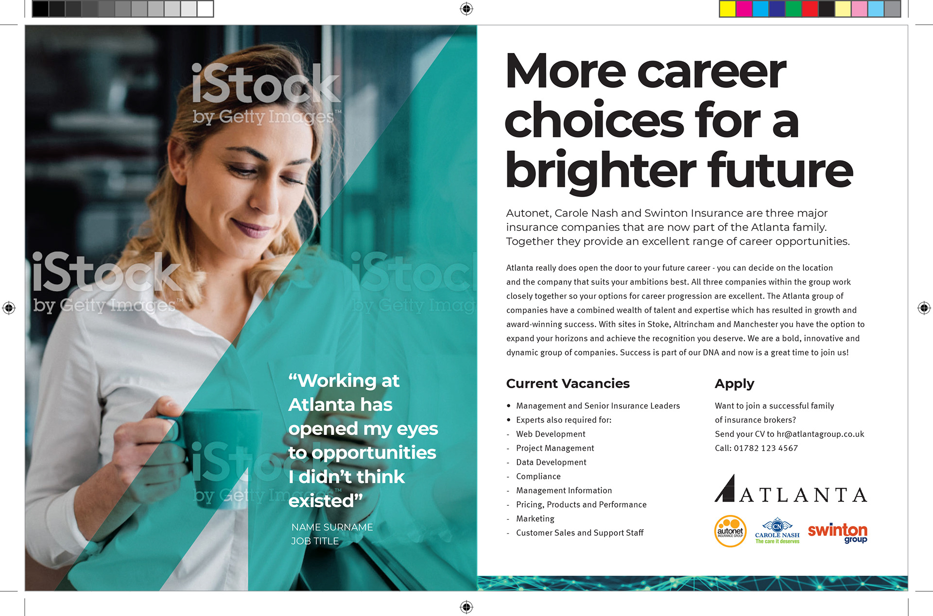
This branding initially started as a parent brand for a number of different companies. I initially envisioned it as a umbrella brand like say Nestle, Unilever, Proctor & Gamble or Diageo etc. This is how I saw it positioned based on the initial brief. I worked on a series of logos that suggested digital or growth and veered on the side of a corporate sensibility - how would this logo look sitting next to the brands mentioned and others? Where would it be seen.
The visibility aspect suggested it might have limited exposure, maybe company reports or as an endorsing parent brand used in the corner of communications. However it developed over the years into something much bigger and more centre stage with the secondary colour (initially used to 'lift'' text off imagery) becoming very dominant. It's evolution continues.
The logo font used is Palatino which has a certain austere quality emphasised by the loose tracking. Its seriousness is offset by the other aspects of the brand such as the secondary teal colour and the friendly practical Montserrat font.
Montserrat was chosen for it's high 'X' height and excellent legibility but also because of it's easy accessibility as it is a free Google font - an important aspect when companies are located at various locations but need to co-ordinate and be consistent with assets.
The secondary teal colour was selected because it was important not to include the colours of any of the initial three companies that made up Atlanta. It was also used because a black 'A' shape in say, the advert, seemed to lack impact and vitality. There are of course other colours but the teal is both modern and fresh and is not weighed down in the usual corporate connotations associated with colours - for example blue and navys which are traditionally chosen to suggest serious dependability in the finance sector.